


Columns
User Guide
Columns | 1.0.1 * |
WordPress | 5.5.1 * |
*When using other versions some differences are possible to occur
** Screenshots were taken from a PC
Table of Contents
2.2.2. Numerical Value of Title
2.3.5. Custom Widget Background
2.3.6. Column Widget Background Opacity
4.5. Add Columns via Shortcode
4.5.1. Add Columns to a Page/Post
4.5.2. Add Columns to a Widget
You can download Columns Plugin here:
https://bestwebsoft.com/products/wordpress/plugins/columns/
1. Introduction
Note: Сlick the “Publish/ Save Changes” button in order to apply any changes. |
1.1. Go to your WordPress Admin Dashboard and find the menu on the left.

1.2. Go to the “Columns” > “Add New” on your dashboard.
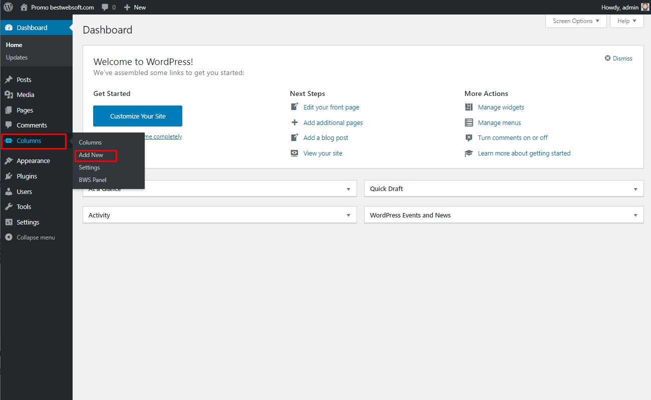
1.3. The “Add New Columns” page will open.
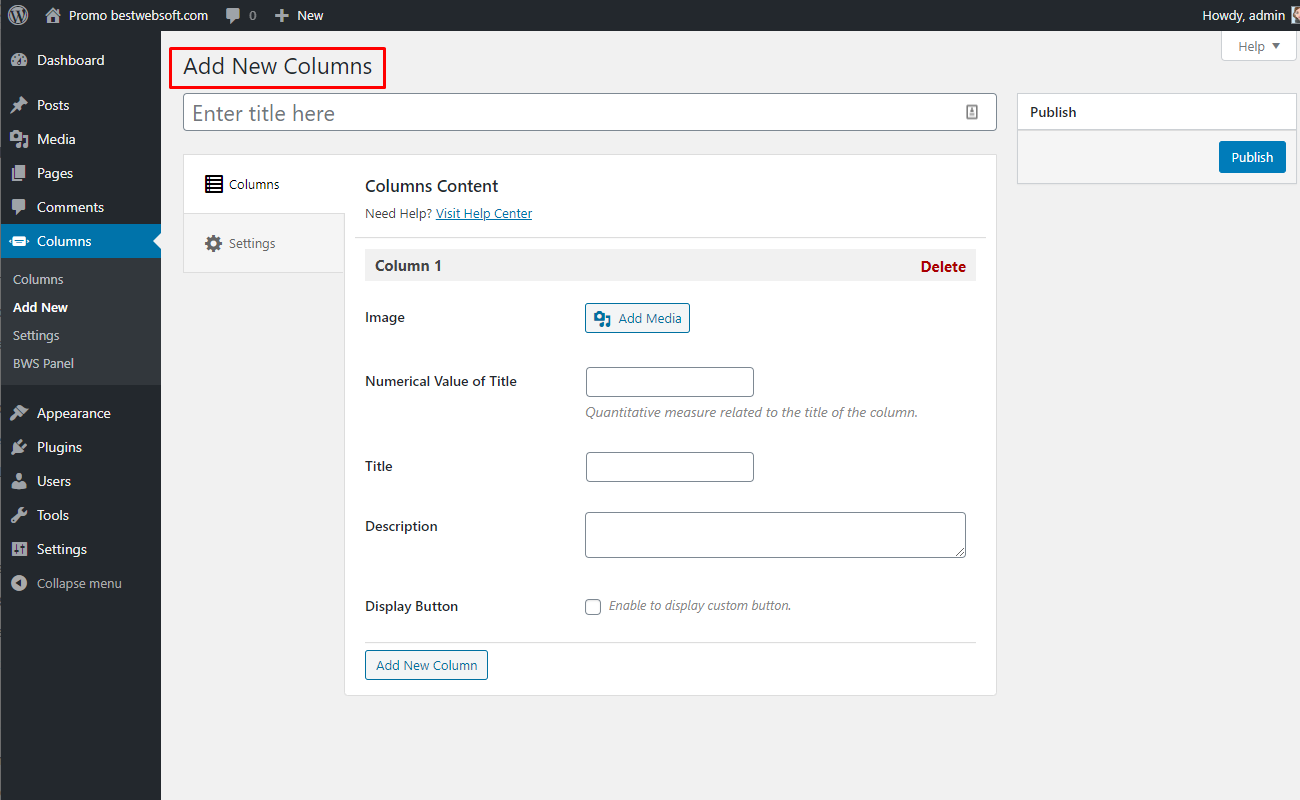
2. Add New Columns
Use the “Add New Columns” page to add information and configure the content of a column.
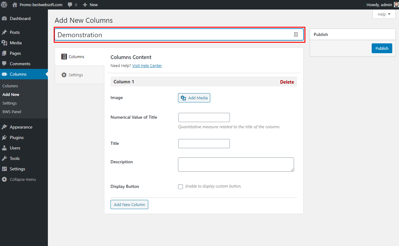
2.1. Add Title
Enter the necessary title of a new columns group to an appropriate field.
2.2. Columns
Use the options of the appropriate “Columns” tab to add content to the column.

2.2.1. Image
Use the “Image” option to add an image to the appropriate column.
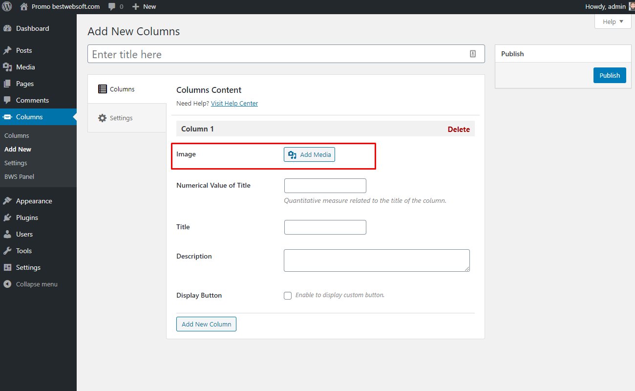
2.2.1.1. Click the “Add Media” button to open the Media Library window.

2.2.1.2. Click the “Select Files” button or drag and drop files into the window to upload new images from your computer.

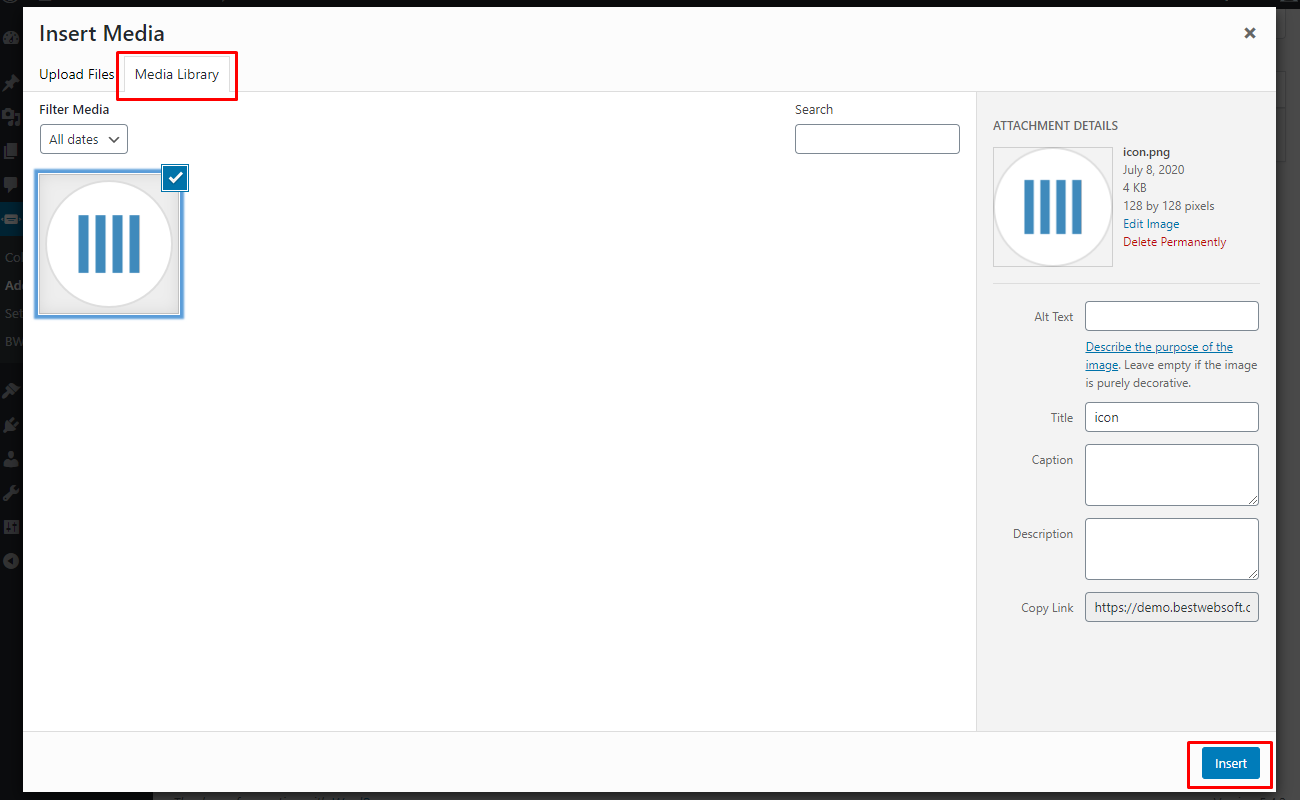
2.2.1.3. Open the “Media Library” tab to choose images that are already uploaded into the Media Library. Select images and click the “Insert” button.
2.2.1.4. The selected images will be displayed in the “Image” option as follows.

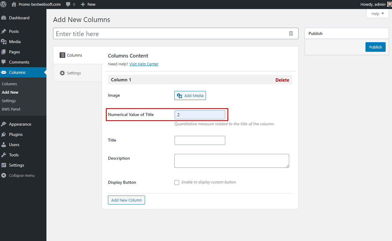
2.2.2. Numerical Value of Title
Use the “Numerical Value of Title” option to set quantitative measures related to the title of the column.
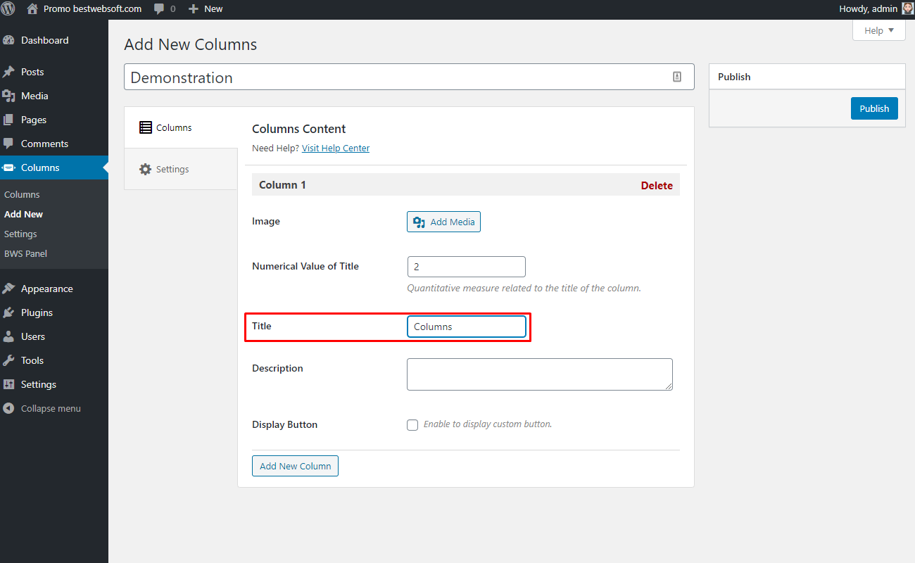
2.2.3. Title
Use the “Title” option to add the title for a column. Enter a custom title to the appropriate field.
2.2.4. Description
Use the “Description” option to add the description for a column. Enter the description text in the appropriate field.

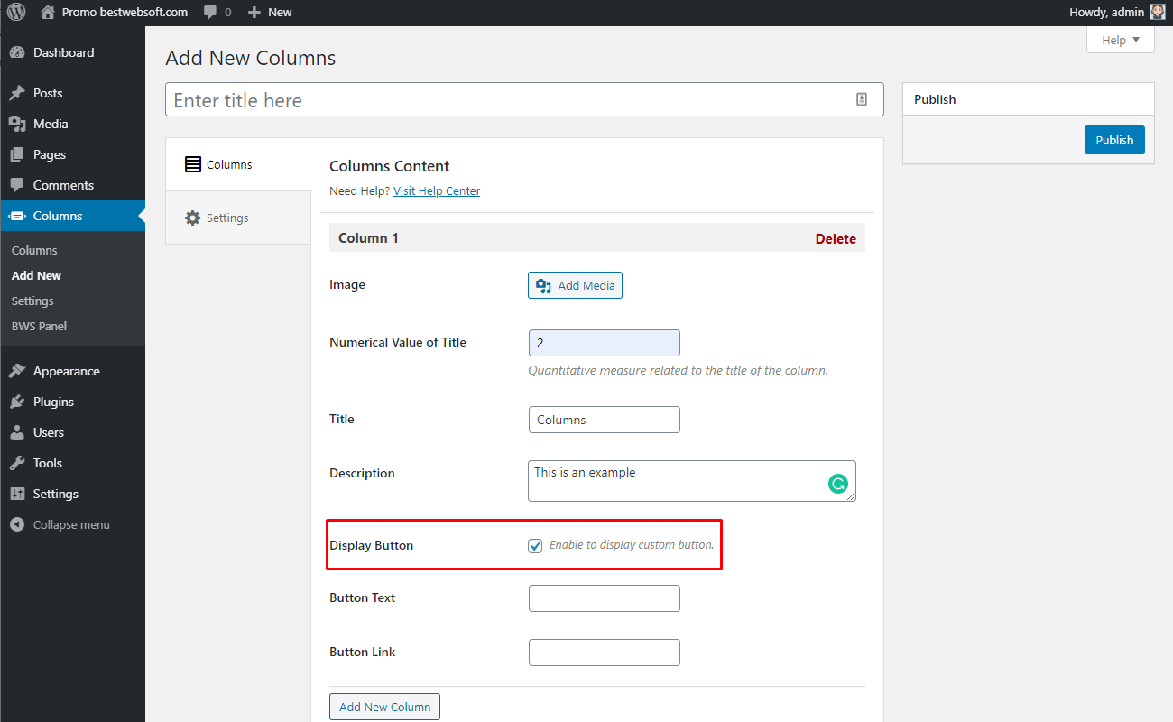
2.2.5. Display Button
Enable the “Display Button” option to display a custom button.
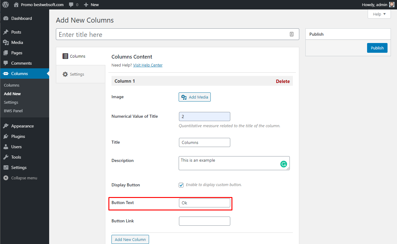
2.2.6. Button Text
Use the “Button Text” option to enter the necessary text of the button.
2.2.7. Button Link
Use the “Button Link” option to enter the proper link to the button.

2.2.8. Add New Column
Click the “Add New Column” button to add a new column.

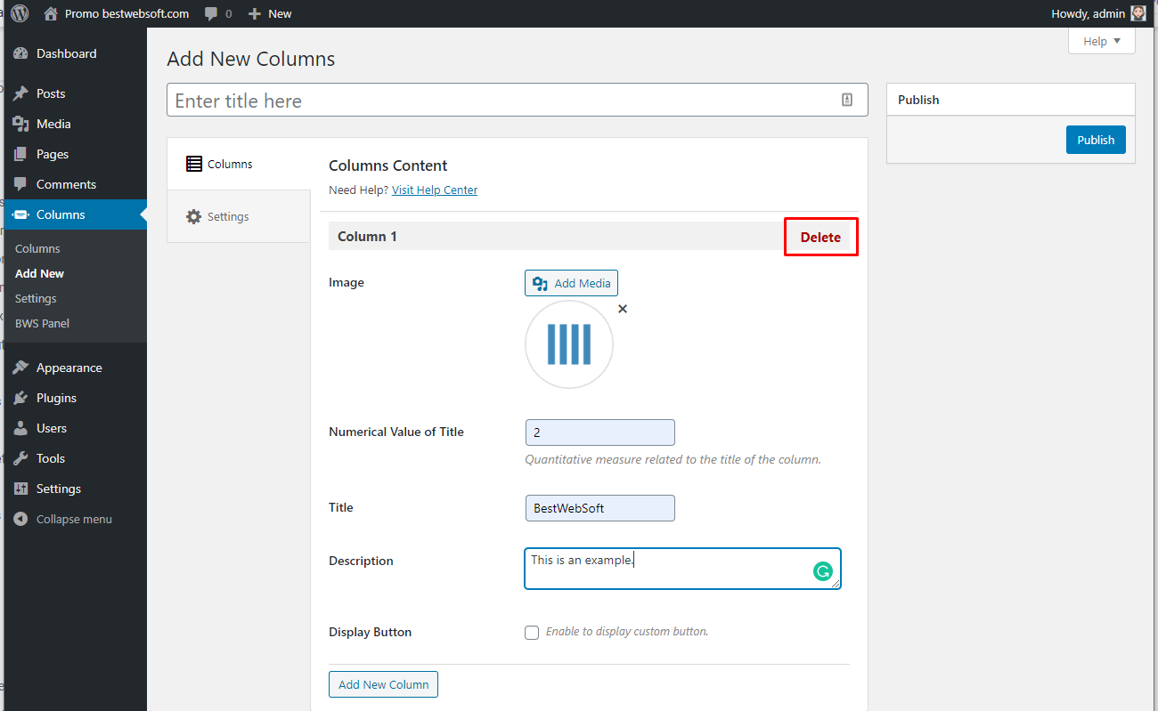
2.2.9. Delete
Click the “Delete” button to delete the selected column.
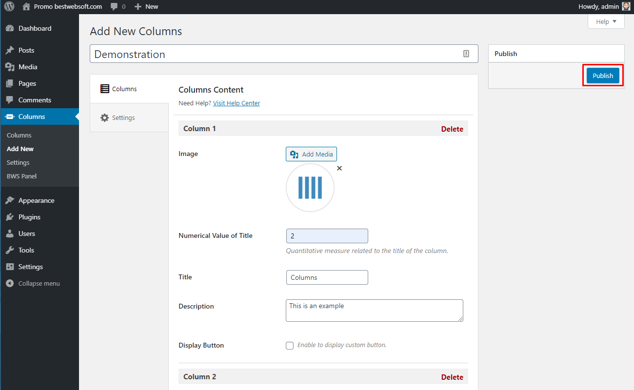
2.2.10. Publish
Click the “Publish” button to save the changes and publish the columns.
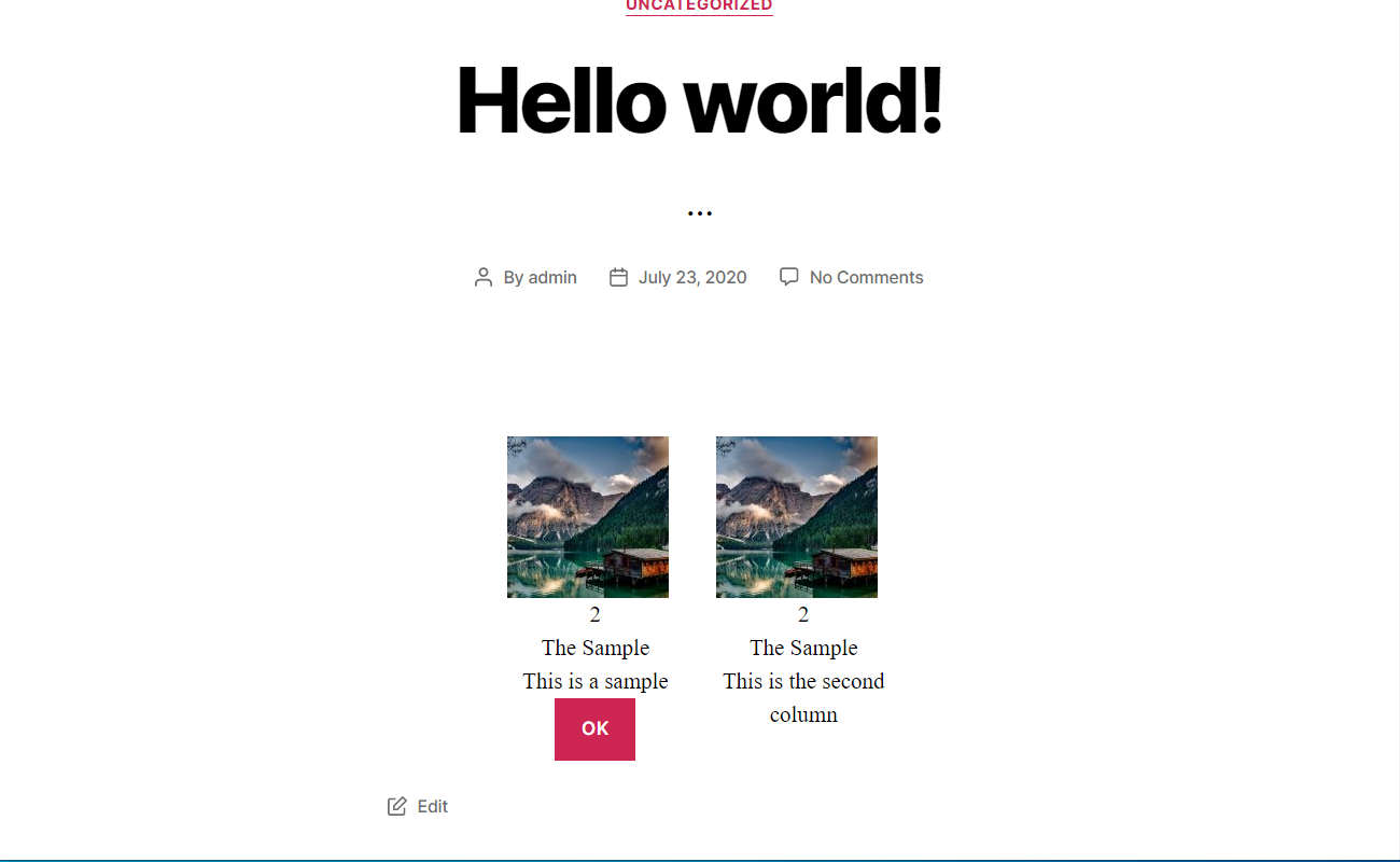
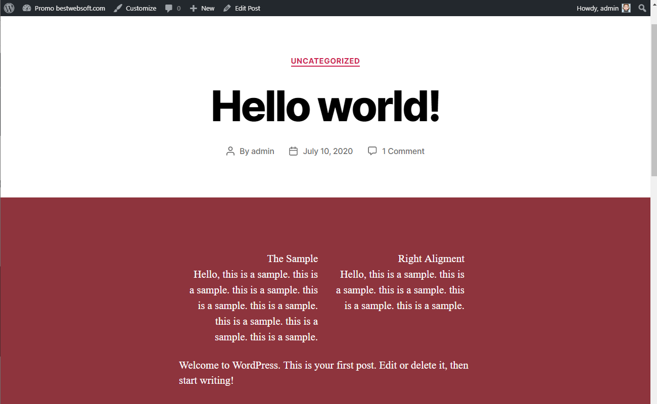
2.2.10.1. The result of columns publishing may look on a page as follows.
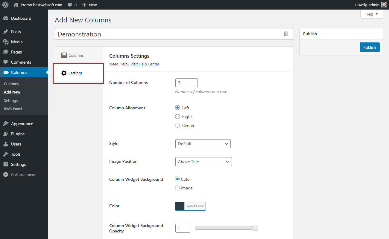
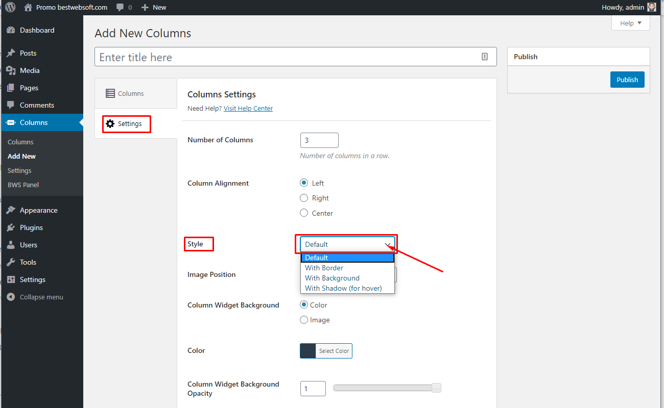
2.3. Settings
Use the “Settings” tab to customize the appearance of columns.
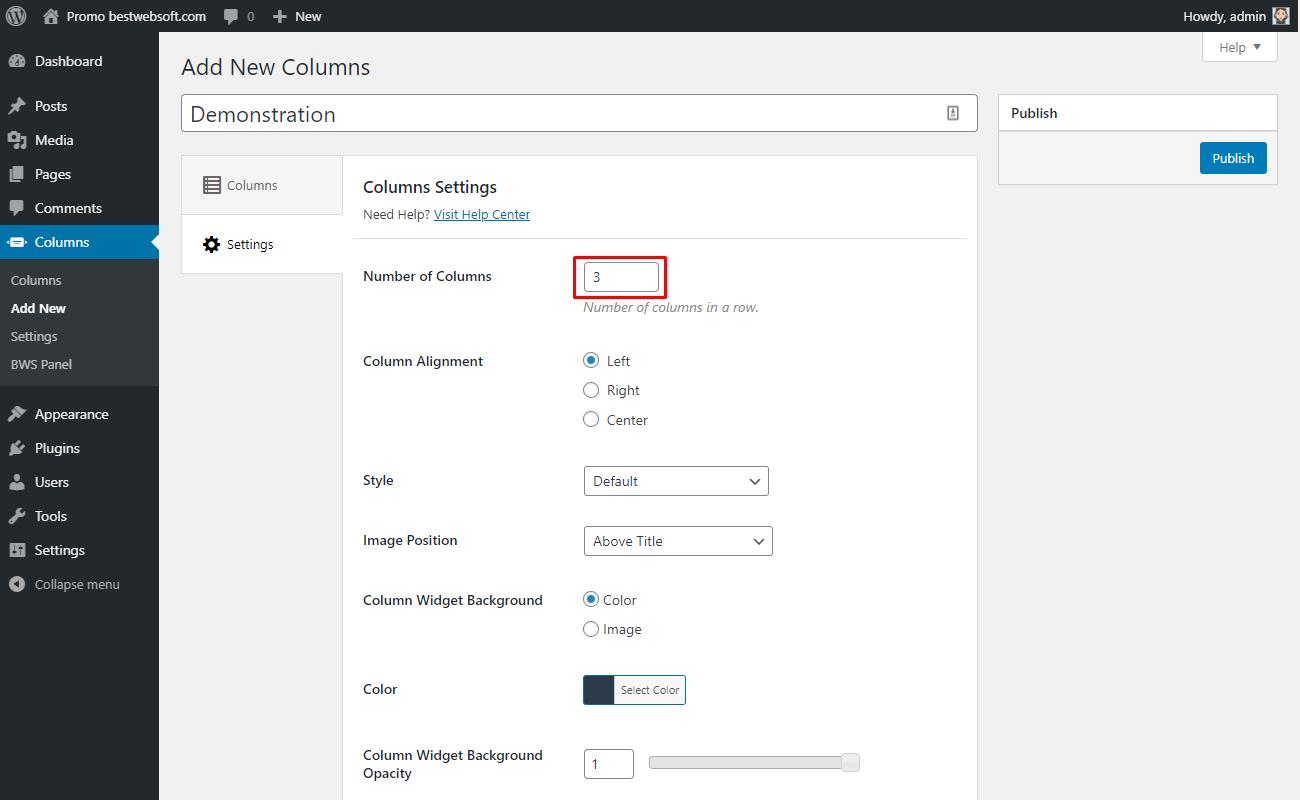
2.3.1 Number of Columns
Use the “Number of Columns” option to change the number of columns in a row.
2.3.2. Column Alignment
Use the “Column Alignment” option to choose the alignment of columns.
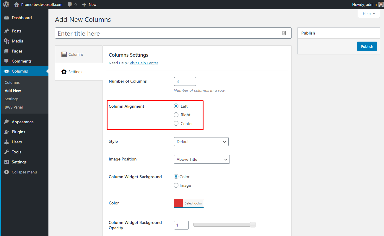
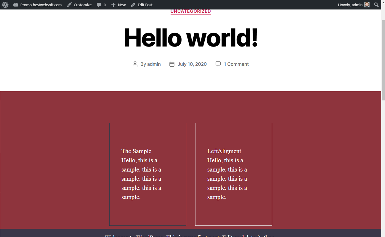
2.3.2.1. Choose “Left” to set the alignment relative to a left part of a block.

2.3.2.2. After saving changes the columns with the left alignment may look as follows.
2.3.2.3. Choose “Right” to set the alignment relative to the right part of a block.

2.3.2.4. After saving changes the columns with the right alignment may look as follows.
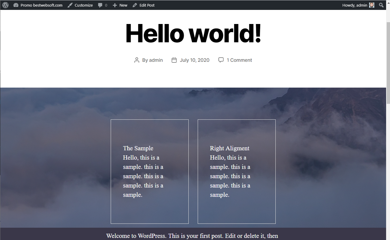
2.3.2.5. Choose “Center” to set the alignment relative to a central part of a block.

2.3.2.6. After saving changes the columns with the center-alignment may look on a page as follows.

2.3.3. Style
Use the “Style” option to set columns custom style. To change the style of a column - select the appropriate value in the “Style” dropdown menu between “Default”, “With Border”, “With Background” or “With Shadows”.
2.3.3.1. Select the “Border Color” and “Border Color” for “With Border” style.
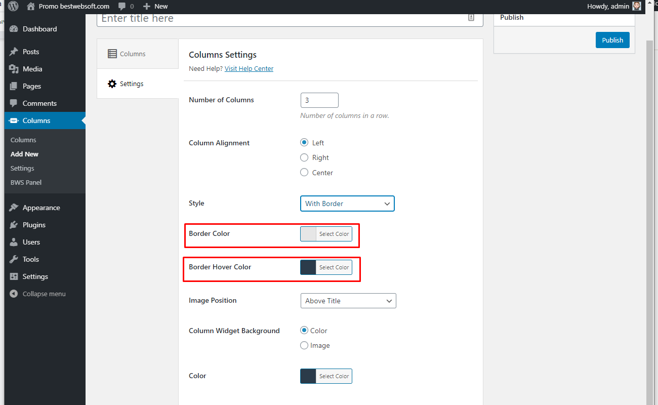
2.3.3.2 Set the color for the border with the color-picker tool.

2.3.3.3. Set the color for hover with the color-picker tool.

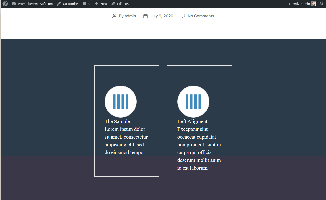
2.3.3.4. After saving changes the columns with changed border color may look as follows.
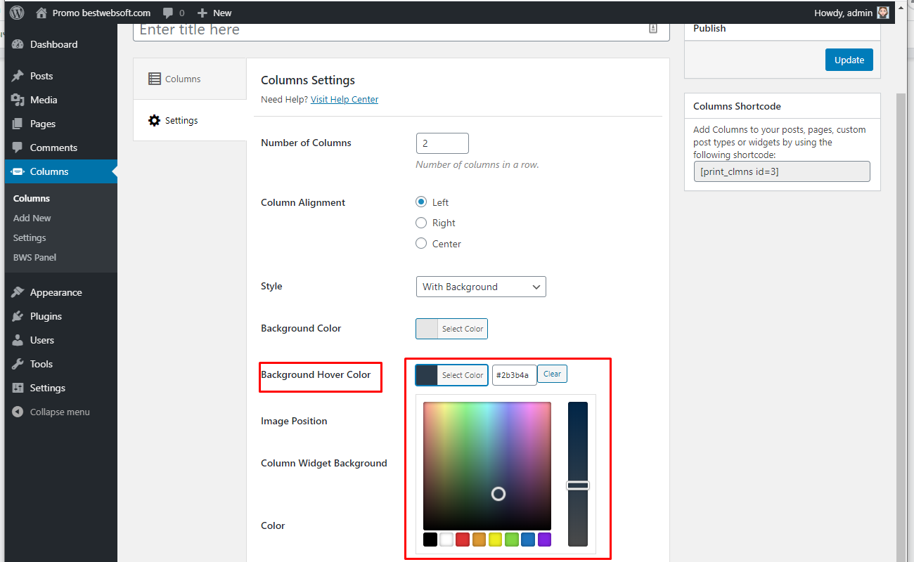
2.3.3.5. Select the “Background Color” and “Background Hover Color” for “With Background” style.
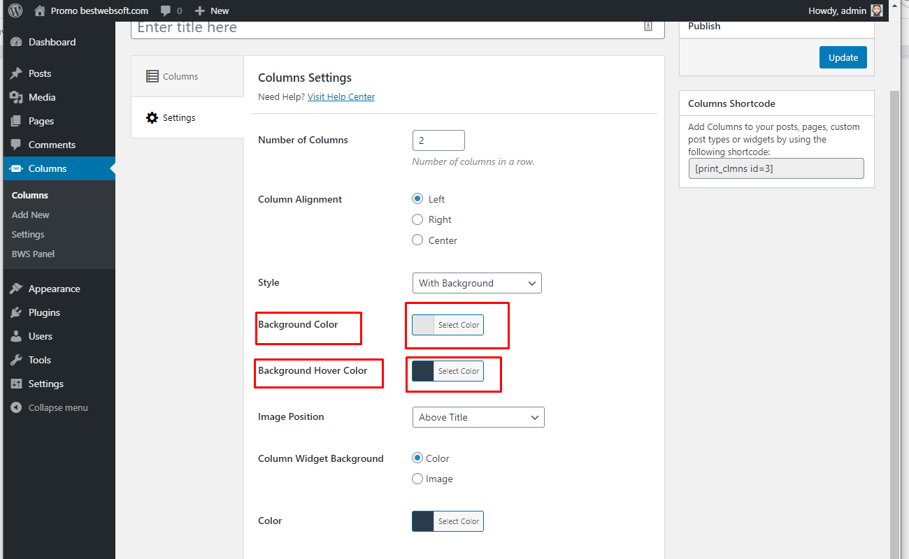
2.3.3.6. Set the color for the background with the color-picker tool.

2.3.3.7. Set the color for the background hover with the color-picker tool.
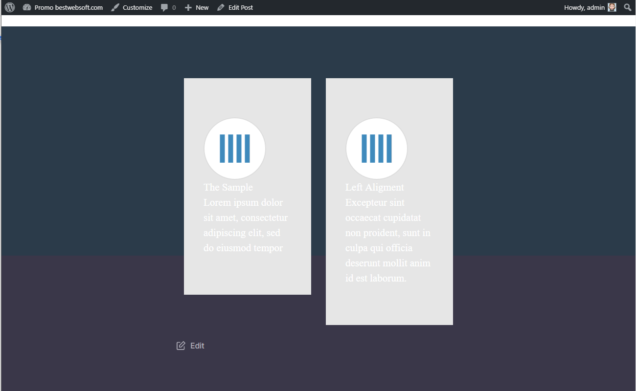
2.3.3.8. After saving changes the columns with changed background color may look on a page as follows.
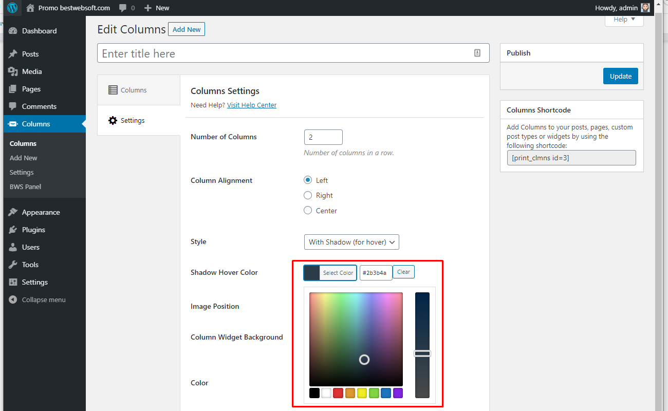
2.3.3.9. Select the “Shadow Hover Color” for “With Shadow (for hover)” style.

2.3.3.10. Set the color for the shadow hover with the color-picker tool.
2.3.3.11. After saving changes the columns with the shadow-styled display may look on a page as follows.

2.3.4. Image Position
Use the “Image Position” option to set the image position in the column. Select the desired position from the dropdown menu.

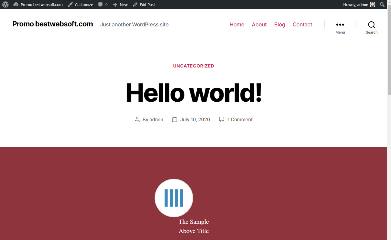
2.3.4.1. Image position “Above Title” may look on a page as follows.
2.3.4.2. Image position “Left Title” may look on a page as follows.

2.3.4.3. Image position “Left Title and Description” may look on a page as follows.

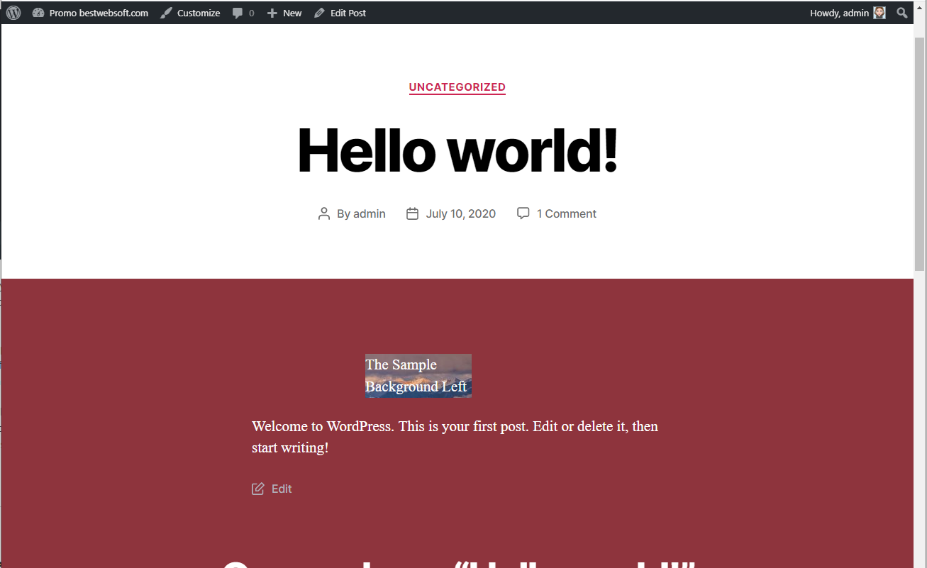
2.3.4.4. Image position “Background Left” may look on a page as follows.
2.3.4.5. Image position “Background Center” may look on a page as follows.

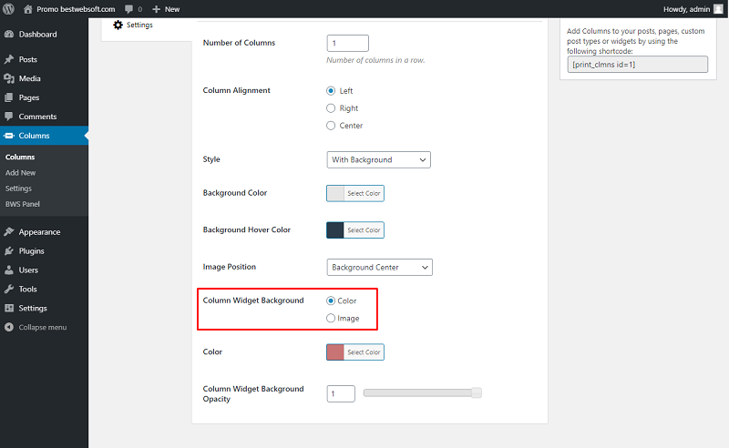
2.3.5. Custom Widget Background
Use the “Custom Widget Background” option for the application of the “Color“ or “Image“ background of the columns.
2.3.5.1. Choose the “Color” to apply the color style background.

2.3.5.2. Set the color for the background with the color-picker tool.

2.3.5.3. After saving changes the columns the color-style background may look on a page as follows.

2.3.5.4. Use the “Image” option to apply the custom image for the background.

2.3.5.5. Click the “Add Media” button to set the custom image for the background.

2.3.5.6. After saving changes the columns with the image-style background may look on a page as follows.
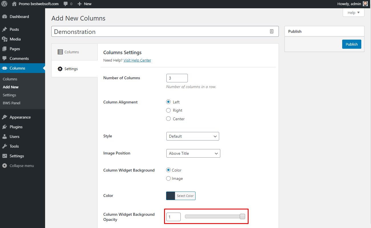
2.3.6. Column Widget Background Opacity
Use the “Column Widget Background Opacity” option to set the background opacity level. Choose the necessary opacity level by the means of a slider or by entering the value to the corresponding box.
3. Columns Settings
Use the options of the “Settings” page to make the settings applicable to all the columns of the website.

3.1. Settings
Enable the “Bootstrap” option, if your theme does not use Bootstrap.

3.2. Miscellaneous Settings
Use the options of the “Miscellaneous Settings” tab to make the settings regarding track usage and default settings.
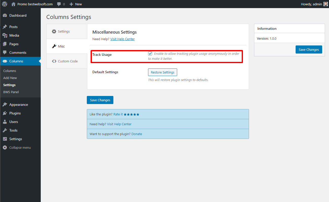
3.2.1. Track Usage
Enable the “Track Usage” option to allow tracking plugin usage anonymously.
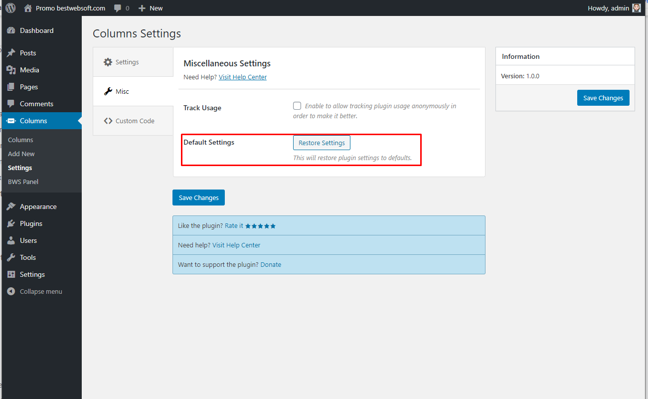
3.2.2. Default Settings
Click the “Restore Settings” button to reset all the settings made previously and revert them to the default ones.
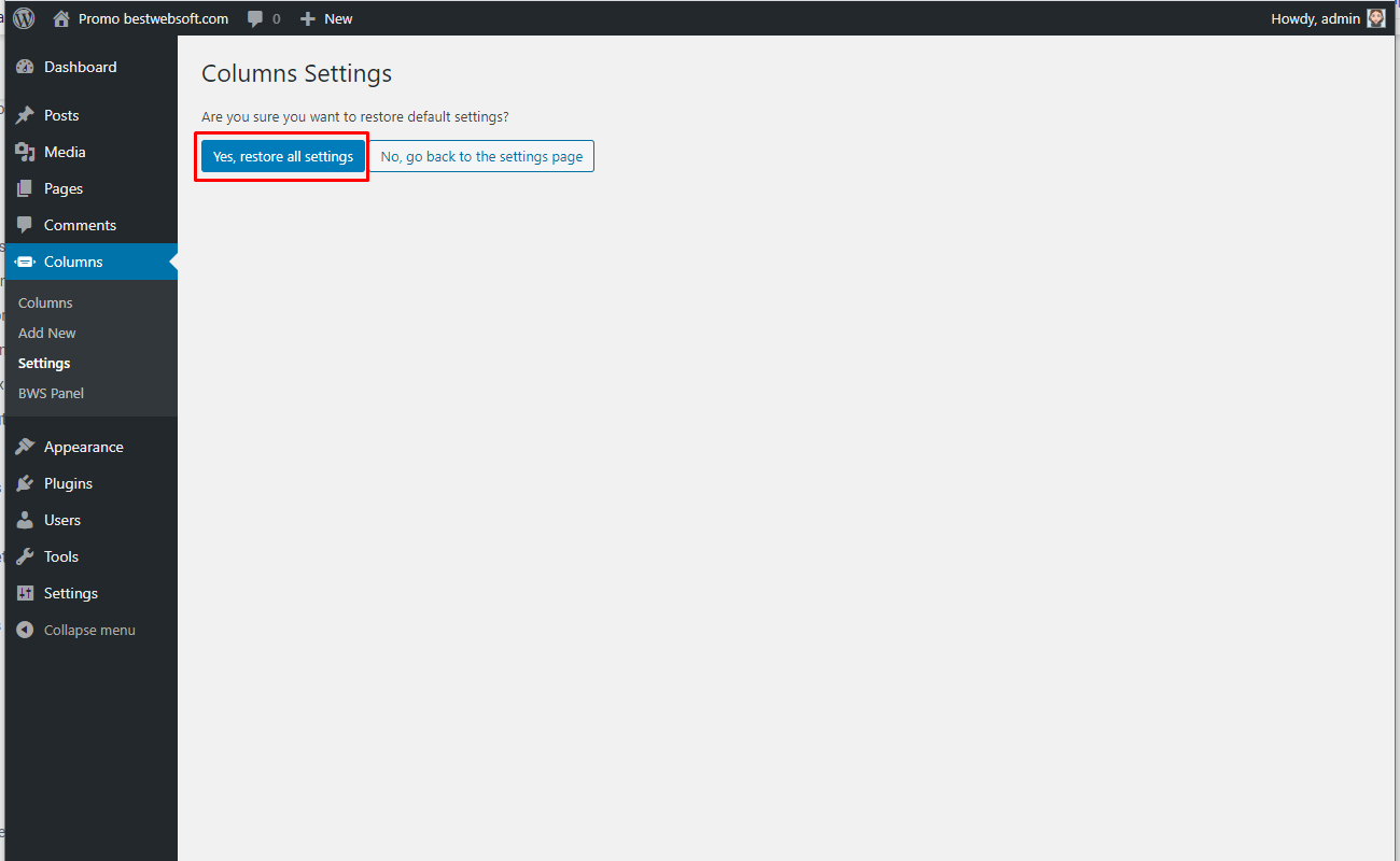
3.2.2.1. Click “Yes, restore all settings” button to confirm the procedure.
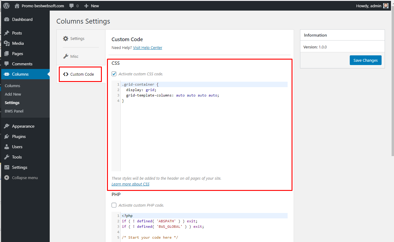
3.3. Custom Code
Use the “Custom code” tab to insert a CSS, PHP or JavaScript code. To activate the inserted code, enable the “Activate custom … code” option and save changes.
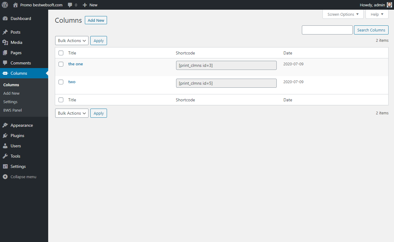
4. Columns
Use the “Columns” page options to set some changes in the existing columns, to delete the column or to do the search.
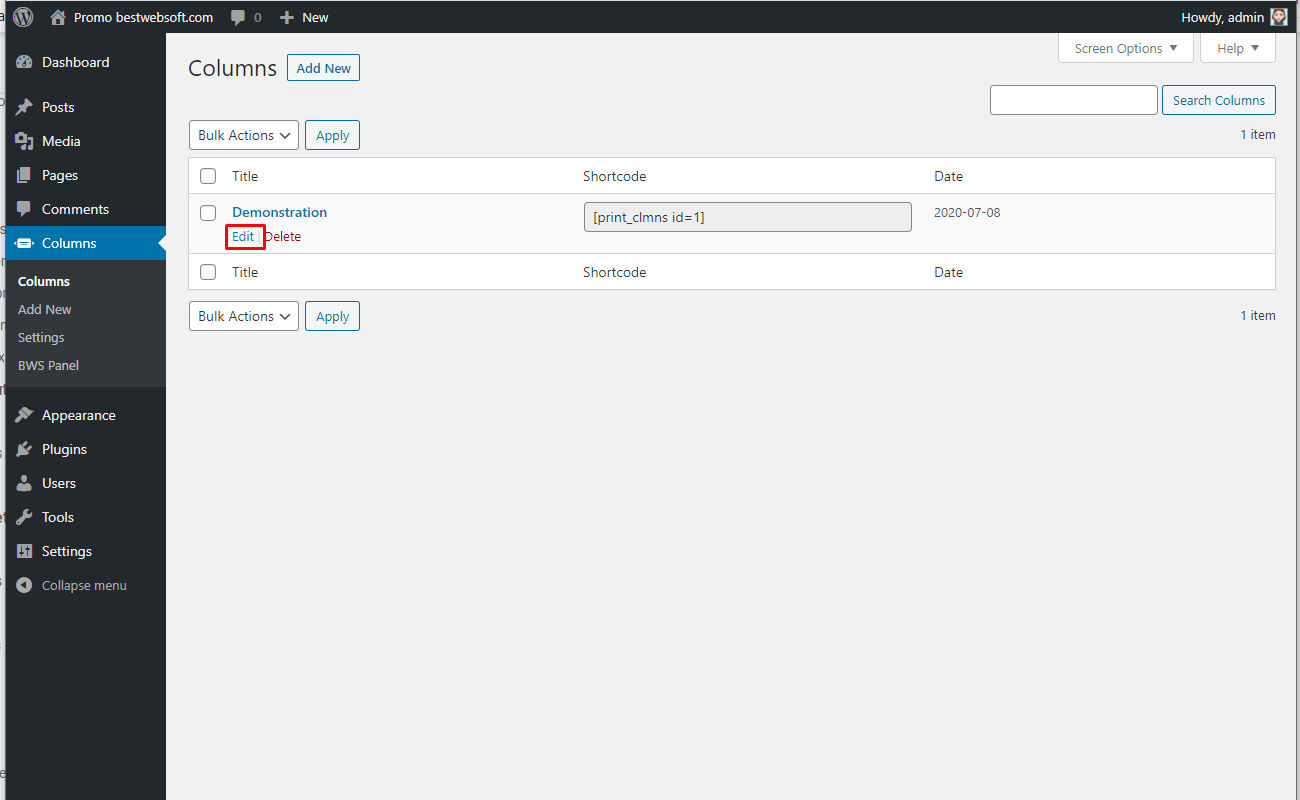
4.1 Edit Columns
Go to the “Columns” > “Columns” on your dashboard. Open the preferred columns in the “Edit” mode and do the proper editions.
4.2. Delete
Click the “Delete” button to delete selected columns.

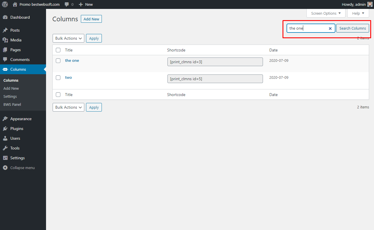
4.3. Search
Enter the title of the column and click the “Search Column” button to do the search.
4.4. Shortcode
Use the “Shortcode” column to copy the shortcode of the necessary column for further insertion.

4.5. Add Columns via Shortcode
Use the shortcodes to add the columns to the appropriate place.
4.5.1. Add Columns to a Page/Post
Create a new page/post, type its “Title” and insert the selected shortcode.
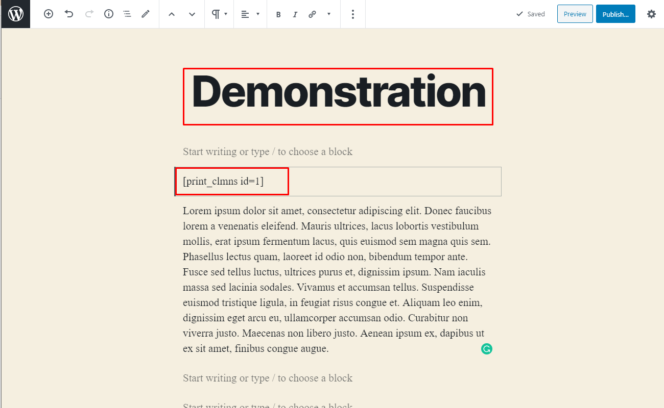
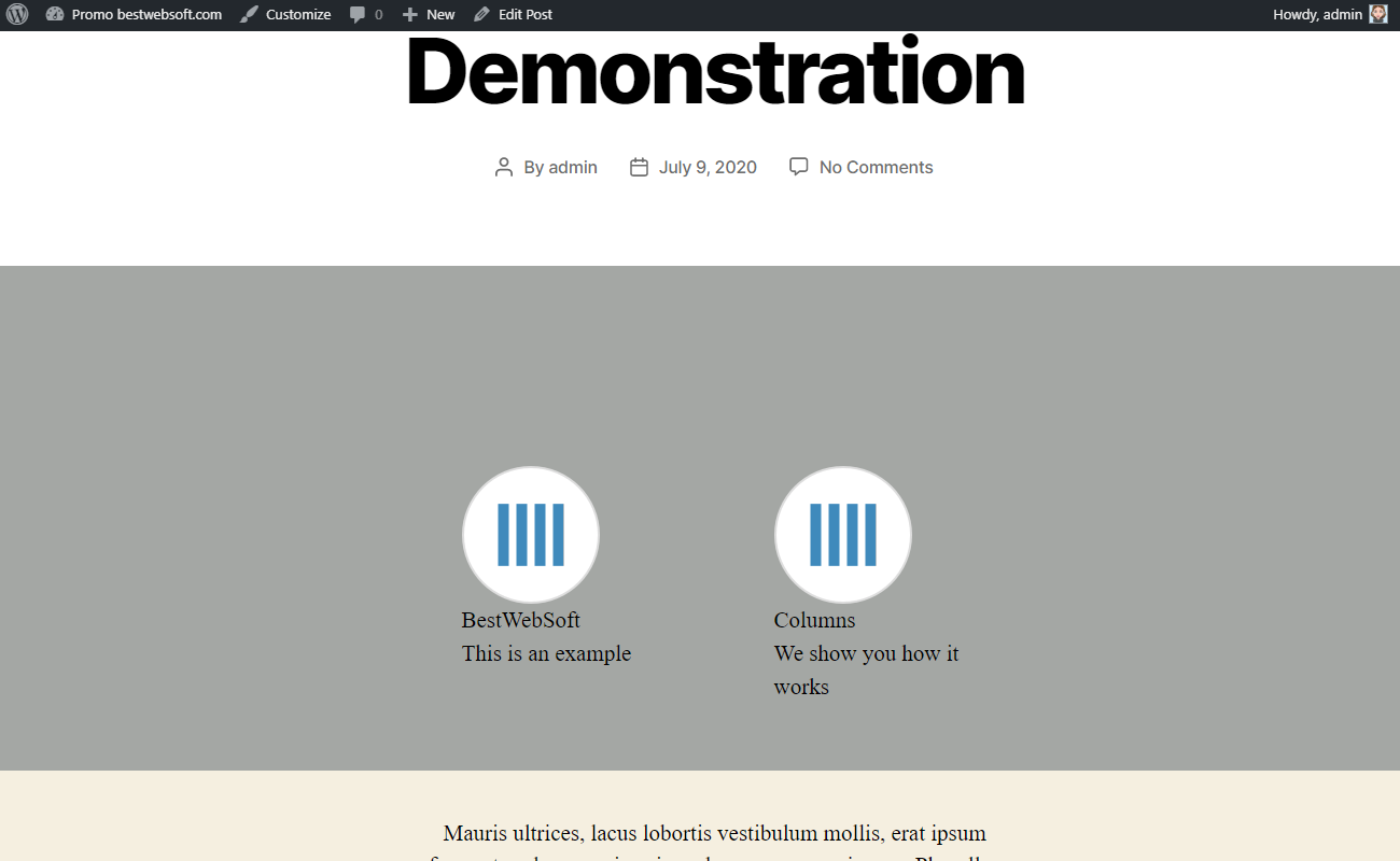
4.5.1.1. Click the “Update/Publish” button to see the columns in the front-end.

4.5.1.1. After saving changes the page with the inserted columns may look on a page as follows.
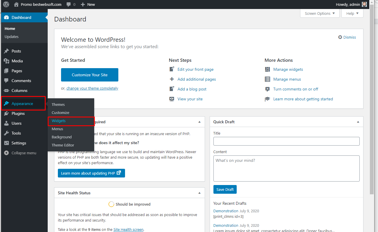
4.5.2. Add Columns to a Widget
Go to the “Appearance” > “Widgets” page on your dashboard.
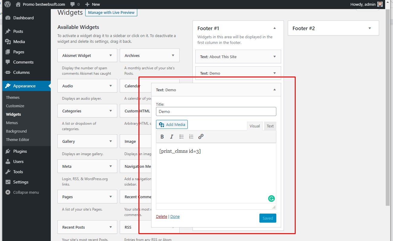
4.5.2.1. Add the widget or edit the existing one.

4.5.2.2. Enter the title and the shortcode to the appropriate fields.
4.5.2.3. After saving changes the footer with columns may look as follows.

Thank you!
Help & Support
Visit our Help Center if you have any questions — https://support.bestwebsoft.com/
Services
We provide additional services such as WordPress themes & plugins development,
graphic design, custom programming.
Contact us now to get a free quote — https://bestwebsoft.com/contacts/