Categories
UX, UI & Graphic Design
Description
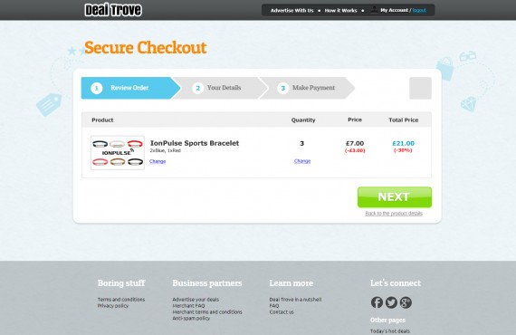
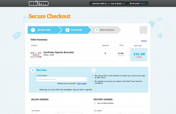
The task of the project was to redesign the look and feel of the checkout process for the webiste http://www.dealtrove.com/
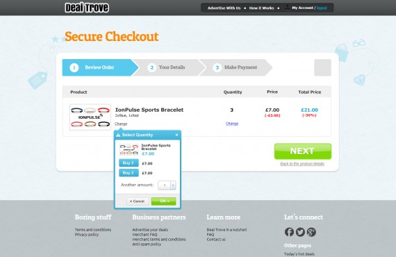
As the result of the project we redesigned the page Review Order and Your details page on basis of the wireframes provided by the customer.
The main requirement was that the design should be consistent with the overall design of the website. The client was looking for very clean design, for example, the use of block color, simple background and simple form because he wanted to make the checkout process as easy as possible.
More Projects
-
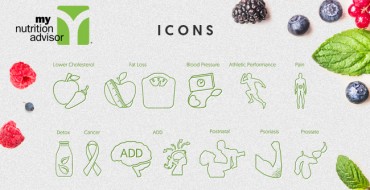
Icon set design
UX, UI & Graphic Design -

LES FORMATIONS À L’ANGLAIS COMMERCIAL
API Integrations, Responsive Web Design, UX, UI & Graphic Design, Web Development -

Style of Food – Restaurant & Cafe PSD Template
UX, UI & Graphic Design
