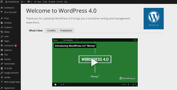
Compared to the previous versions, WordPress 4.0 is not an outstanding issue. However, it had already caused an excitement.
So let us have a look at the new useful features that it offers for us.
Internationalization is an important issue in the modern world. Almost 30% of all WordPress users use languages other than English which is, in its turn, almost a quarter of the total number of users. New version 4.0 provides the possibility to find the necessary language with ease. Actually, the first installation screen will ask you to do it instead of searching for your native language through the web, installing it manually and changing the config file.
That is pretty nice, isnt it?
Embedding your content into posts has become much more pleasant. In old versions, all you`ve seen in place of a gallery or other media inserted items was a grey box. The new version took care of it. If you insert a video URL in text mode, you will see it in visual mode. It is very convenient.
The same applies to media content from other URLs. It was upgraded the same way. The video becomes playable as soon as you have entered a link. This feature works with all popular services from Twitter to Vimeo, Flickr and Hulu.
The media section got a gridview. It is not an invention of the wheel, however it makes spending time in WordPress more pleasant by introducing a sleeker UI which is definitely the technology of future.
This small change gives you better look on of your media files than the standard page with twenty images.
The traditional “Add New Plugin” page has been changed as well. It comes with modern interface and renewed indication. The main navigation panel looks like the media section navigation. It is time for developers to start making thumbnails since the plugins screen has got a new look.
This feature really made the screen real estate better. On the compose/edit screen the post editor was turned into a box of medium importance which makes the editing process much easier. Usually editing is a frustrating scrolling-box-within-a-scrolling-box situation with a lot of distractions, since the screen height is not used with full advantage. To let you focus on your content while editing, the editing process was moved closer to the distraction-free editing experience.
It is nice when the theme customizer includes widgets. However, things became overcrowded if you have more than 6 widgets. In WP version 4.0 a sub-section of the customization screen stores all your widgets which minimizes the use of your resources.
Traditionally, WordPress` updates are relatively frequent. By installing the Updater plugin, with a couple of clicks you will always be sure that you have the latest WP version. WordPress is a large community, enjoy every moment of being involved.
WordPress 4.0 did change a lot as opposed to WordPress 3.0. The developers worked hard to bring us a better user experience by improving existing features instead of adding a bunch of new ones. All features mentioned above will actually affect your WordPress website in a positive way.


