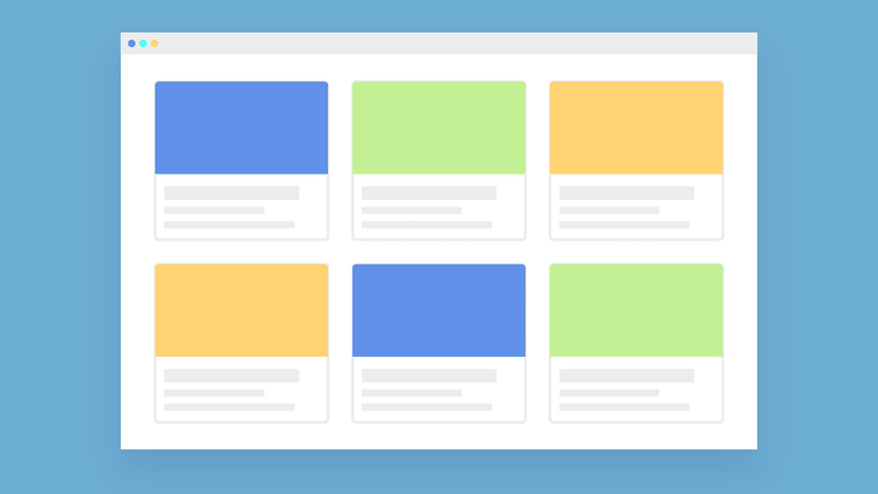
A user interface is a physical form of your website or application design. Some people ignore the importance of it, and in this article, we’re going to prove that they are making a huge mistake.
Design of your project is one of the most important steps of bringing your idea to life. But how to understand whether this interface is successful or not? To answer this question, you’re going to need some facts about it from specialists. These tips are going to help you with understanding the importance of the right design.
1. The Less Text You Have, the Better
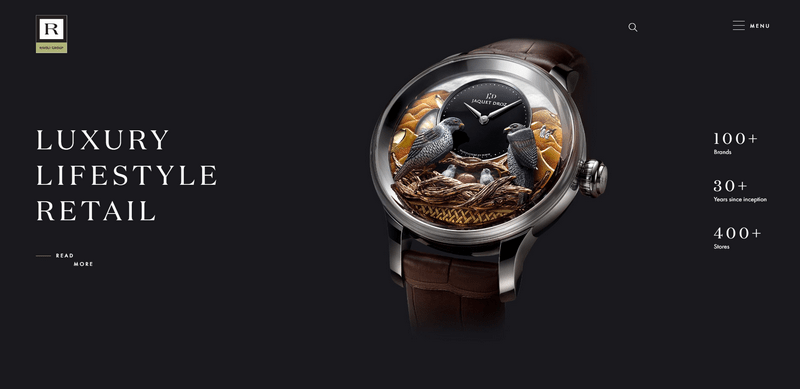
Users are not always in the mood to read, especially when it comes to some topics which they want to get acquainted with quickly. Most modern people perceive visually better, so they will notice and remember the website, which presents information by using diagrams, pictures, graphics, videos, etc. Long and boring text may not attract the attention you need. If you want to post a long article, try to divide it into small subthemes visually and add some visual content for better comprehension. Highlight some important information so that users in a hurry could find the necessary information very quickly.
2. A Simple Interface Is a Success
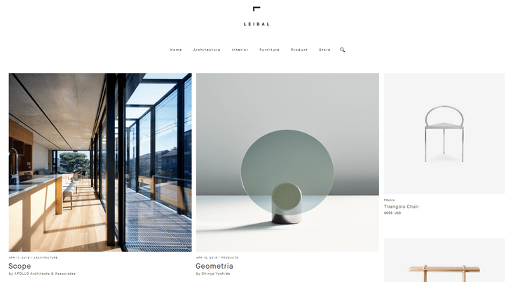
Some users don’t know anything about programming and they can’t realize the whole functionality of your website or application. The lack of time that they can set aside for searching the information makes no help too. The main characteristic of modern successful design is minimalism and high functionality that is understandable from the first sight. Remember that users aren’t looking at your app or website as you do; they just came here for information they need and leave after finding it. You can interest them by presenting more content that they may need in the future. Try to use your design to demonstrate that there are more topics related to their interests.
3. The Home Page Has to Be Designed Properly
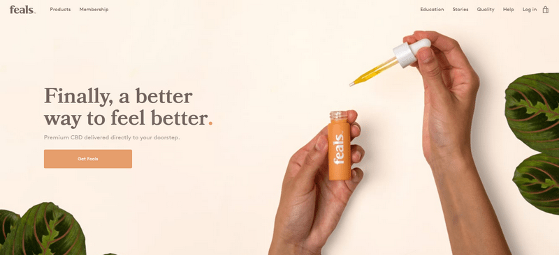
Most users leave right after viewing the main page if it doesn’t meet their expectations. Of course, we are sure that your project has many functions and features that are worth attention, but a modern consumer is used to do everything quickly. So, the task of your home page design is to show that you have what they need and even more.
4. A Responsive Design for Both Computers and Mobiles
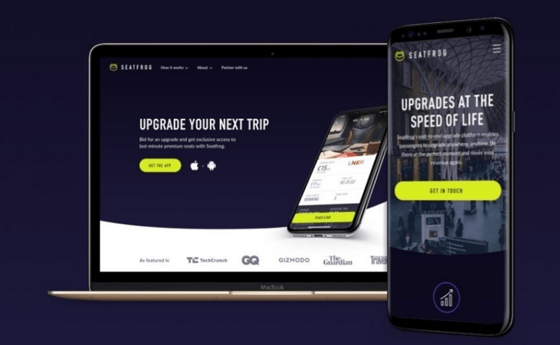
A mobile screen differs from the computer monitor, which is huge in comparison. Make sure that your minimalistic design is full of visual content and a small text. It has to be easy to deal with on a mobile phone, where you have to tap on the screen. Make sure to create an animation and other features for Android and iOS users – swiping, scrolling, etc. Refreshing the page by dragging it down will be very useful too.
5. Feedback
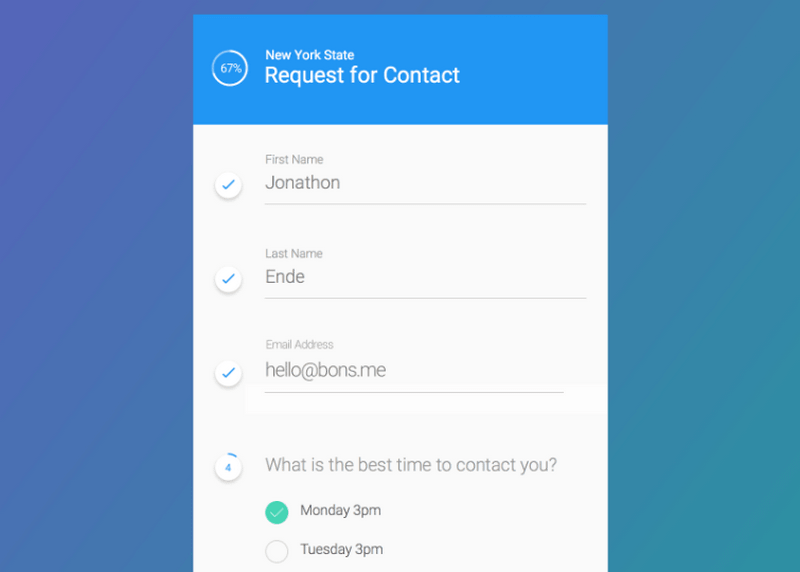
Every action has the consequences. In our case, we are talking about demonstrating that the user’s actions were successful. It can be a message with the word “Complete” or even a small check mark. Without it, the user might think that his form was not accepted by the service, which can be very upsetting. So, the quality design guarantees that there is feedback. Make sure that your system is able to cope with this simple task as fast as possible.
Final Thoughts
User interface design has its own fashion streams too. What was considered to be attractive and progressive five years ago, now is obsolete and irrelevant. Experiment with styles and visual decorations to attract more users. The more effort and passion you invest in your projects, the more likely it will be successful!
