Great advertisements enhance the user experience instead of disrupting it.
By their nature, advertisements are interruptions. This is true whether it’s a multi-million-dollar Super Bowl ad or a fifty cent click on a search engine link.
But that doesn’t mean ads need to be intrusive or disruptive – though many of them are. The very best advertisements add value to the user experience, letting it become something greater than it would be otherwise.
Super Bowl ads are special because they entertain. They fill in the sports event’s necessary pauses with clever and highly engaging content that millions of people talk about for months afterwards. It’s a great way to heighten the experience of a televised sports match consumed primarily for – you guessed it – entertainment.
Your website is not fundamentally different. It serves a purpose, and supports technologies that can amplify the impact of content that serves that purpose. The main difference is that you have the ability to craft your own advertisements and host them on your own platform. You are in total control of the user experience from start to finish.
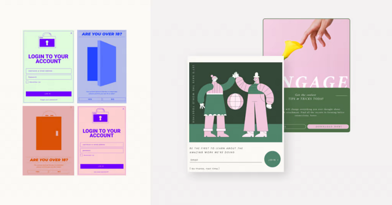
Popups can play an important role in how that experience feels to users. When used properly, they enhance the user experience and drive value by qualifying leads and upselling products.
Choose the right popup builder

In order to use popups correctly, you must be able to configure them in detail. Like all Internet-enabled digital ad technologies, popups work best when used on targeted audiences based on behavioral and demographic data. Your choice of popup builder directly impacts your ability to collect and use this data.
Today’s digital content environment demands high-fidelity targeting and personalization. If you can personalize popup messages to address website visitors’ needs proactively, you have much to gain from your digital ad strategy.
A generic popup plugin simply won’t do. You need a comprehensive popup builder that goes beyond simple trigger logic and gives you a wide range of options. You’ll want to design your popups to fit the tone and brand of your web page. You may even wish to incorporate animations. These are all sophisticated features you’ll find on a premium popup builder.
Elementor is a great choice because it puts powerful personalization and design features behind an easy-to-use, intuitive interface. This enables non-technical WordPress website administrators to quickly build, publish, and fine-tune their popups to drive conversions. Integrating a full-featured popup builder into your WordPress tech stack gives you the tools you need to make great popups that enhance the user experience.
Prioritize message clarity over all else

Since popups are designed to command the immediate attention of users, it’s important they deliver a coherent, easily digestible message. If your popups look like pages out of a novel – filled with text that requires careful reading – they are virtually guaranteed to fail.
Great popups give users a chance to put themselves on the right track, whatever you think that track should be. They might be reminders, alerts, or urgent promotional opportunities. In order to do this without compromising the user experience, they must have absolute clarity.
The value of clarity should be immediately obvious at first glance, but let’s break down exactly what it takes to achieve that. A clear marketing message must be brief, actionable, and relevant.
- Brief messages avoid placing a heavy cognitive load on web page visitors who may be skimming through your content without paying full attention to it. When your popup triggers, it may only receive users’ attention for a fraction of a second. Make that time count by delivering a strong, coherent message without diluting it.
- Actionable content gives users a sense of immediate agency. Your popup shouldn’t tell people to do something next week. It should tell them to do something right now. The easier you make it for them to take that step, the more successful your popup campaign will be.
- Relevance comes from context. Your popup content should derive some of its value from the context of the page it triggers on. For example, you might place an upselling ad on a popup set to trigger on your checkout page. This is a contextually valid place to tell customers they could get more out of their transaction by upgrading their purchase.
By its very nature, brief, actionable, relevant content is almost always clear. Your content speaks to its immediate context, gives users something they can do about it, and encourages them to act on that impulse quickly, before they slow themselves down analyzing all the details.
Show popups to the right people

The time for generic popups that display for everyone has long since past. The more personalized and contextually relevant you can make your pop messaging, the better. One way to do this is by triggering your popups to show for narrowly-defined groups of people.
Audience targeting is a must-have feature on any professional popup builder. With a bit of time and effort, you can create a wide selection of popups that serve a variety of target groups. For example, you might start with some of the following categories:
- Repeat website visitors who haven’t been on your website for more than a month. (“Welcome back!”)
- Website visitors accessing your website after successfully converting or buying your product. (“Thank you!”)
- Leads who have downloaded three lead magnets in the past month, but not yet converted. (“Here’s a surprise discount!”)
- Website visitors logging in from foreign countries, or with browsers set to a non-English default language. (“¡Se habla español!”)
These are just a few ideas you can put to use when creating popups. With timed triggers and integrated customer relationship management software, the possibilities are endless.
Configure trigger times according to page and goal

In advertising, getting the right message to the right person isn’t quite enough. You also need to make sure that message comes at the right time. This isn’t easy to do with traditional advertising channels, but with a popup builder, it’s simple.
High-quality popup builders let you time the delivery of your popup content according to user behaviors. That means you can set a particular popup (targeting a specific user category) to trigger once those users meet a certain set of conditions.
That could mean waiting a few seconds after they open a web page and begin browsing its contents. It could mean triggering a popup after they scroll through half the page or reach the very bottom. Timing your popups well can deeply impact the overall success of your advertising campaign.
Spend some time configuring popups to trigger based on page context and the goal of the popup message itself. A welcome campaign popup should probably trigger within the first few seconds someone accesses your homepage. An upselling campaign is better-suited to qualified leads who are actively consuming content, or preparing to go through the checkout process.
Don’t mess around with the close button

One of the newer trends in popup design involves hiding the button that closes the popup, or removing it from its standard location in the top-right corner of the window. At first glance, this is a clever way to keep users’ eyes glued to your popup content, but it may cause more problems than it solves.
Regardless of how well-planned your popup advertising campaign is, some people will choose to close your popup, and that’s okay. For years, traditional advertising has focused almost exclusively on “impressions” as a key metric. Popups guarantee an impression whether users interact with them or close them, and those impressions are important.
Hiding the close button may earn you a quick win in terms of popup engagement, but it’s a losing strategy in the long run. Whenever your website’s design makes it hard for users to do whatever they want to do, it ultimately ends up costing you. If users want to close your popup, the best user experience you can offer them is a visible, easy-to-locate button that gives them that option.
Web Designer Depot takes its popup close button one step further. Simply clicking on any area in the background next to a popup will make it close. This is a good way to prevent popups from becoming disruptive, while still ensuring they get in front of the people who need to see them.
Optimize for mobile

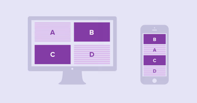
Most website owners already know they need to offer a fully responsive mobile experience to users. There are many aspects of the web experience that differ widely between desktop and mobile versions, and popups are one of them.
The most noticeable difference is orientation. Mobile devices are largely designed to work in portrait mode, which means you’ll need to create popups that adhere to this standard. This might give you less room than you’re accustomed to on a desktop.
On the other hand, mobile touchscreens offer a wider range of inputs than desktop cursors. You can design interactive popups that respond to swiping, pinching, and tapping in novel ways. These kinds of gamified popup interactions give you room to be playful and engaging while keeping users focused on the content you think matters most.
Analyze popup performance regularly
Many website owners don’t get popups right on the first try. Even if you do, you’re bound to notice opportunities for improvement as time goes by. Split-testing your popups is a great way to continuously optimize their performance and make sure they continue to deliver value to users. Spend some time analyzing the performance of your popups and refine your approach so you can improve the efficiency of your website’s marketing machine over time.

