Why Good Website Navigation Makes a Difference
It’s pretty simple – navigation on your website creates clear paths for your visitors in their journey. It is significant for how quickly and easily the important information about your business can be found when the content will be displayed to users, and what they can expect around the corner.
Good navigation can help your users discover the content they are looking for and a solution to their problem which brought them to your site in the first place. The engaging navigation will translate users’ interest in a decision.
Another aspect where the website navigation is critical is SEO. If your users don’t understand where they land with their next click, bounce on the page or cannot decide what is their further action, this can be taken as poor user engagement signals for search engines and will eventually hurt your site’s ranking.
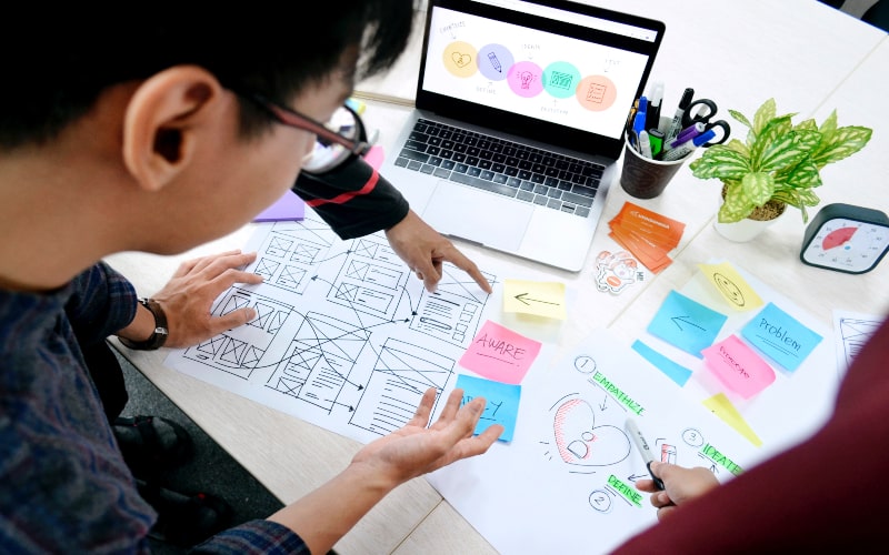
4 Most Popular Types of Website Navigation and How to Use Them

Now that we have ascertained the impact of navigation, let’s take a closer look at the options that you can use on your site and how they reflect in user experience.
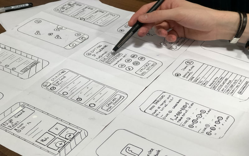
1. Menus and Sub-menus
When talking about navigation, menus, and menu options are the first thing that most people would think about. They represent the information architecture of your website and give people structural guidelines.
Top menus and side menus, interaction through drop-downs or sliding menus, carousels are the most common solutions and most familiar to the audience. A well-designed menu should be more about function than fashion – clearly visible and in locations where users expect to find them – to assist your audience in their needs and create a positive user experience.
2. Icons and Buttons
The small navigation elements like buttons, icons, clickable images can have a huge impact on usability: they are eye-catching and universally understood even if your users don’t speak the language of your site. Most internet users will intuitively associate the gear icon with settings and the shopping cart with a place where they can complete their purchases. Undoubtedly, people tend to perceive images faster than words so icons will give your user visual clues and move them forward.
Call-to-action buttons with clear and descriptive labeling will serve as simple indicators and can greatly facilitate the visitors’ engagement and eventually conversion. Colour accent is an obvious yet logical design solution to draw the attention of your audience and nudge them to the right clicks and taps.
Clickable images are a very popular form of navigation for case studies or blogs. A smart design would pursue a goal to avoid information overload and support the content without extra details.
3. Links in the Text
Navigation via links in the text is based on a very simple principle – if your users like the content they’re viewing suggest them to click and see another similar content. Other forms of linked text such as a table of content, links to case studies, or related content will keep users on your site and help to enhance and intensify their interest in your product or service.
The design approach for the linked text should aim to restructure site content to be less text-heavy, more clearly labeled, and located in the places that make sense for the users – eventually impacting their experience on your site.
4. Scrolling vs. Clicking
The design choice in favor of either navigation option – scrolling or clicking – is entirely made based on the behavior and needs of your target audience. And one of the tasks in designing is to ask questions and find out what will be ideal for your visitors.
In today’s world, the role of mobile accessibility and scannable content increases rapidly. Scrolling is of course a more natural and easier way of navigation on mobile devices – users don’t have to wait for new pages to load and can engage with your content at their own pace.
Scrolling navigation is recommended for primary landing pages of desktop websites too. To ensure a great user experience the top-level content should provide proficient and easily readable information for your visitors before they can make a decision.
Although scrolling is a more common way of viewing the content, clicking is an important factor both for mobile and desktop website user experience. Placing conditions for clicks too early or having too many steps and clicks to complete a transaction can discourage your users and make them drop out.
Clicking can be great for navigation when the user has made the decision and is ready to get down to business. Using clicks on individual product pages, making clickable activity easy to tap, having clear and direct descriptions for call-to-action buttons – is the area where clicking can ensure a winning experience and a great journey on your site.
Best Practices for Website Navigation Design – When Less is More
To sum up, the variety of options for your website navigation here are some pro tips to get clear, intuitive navigation:
- Reduce the number of primary menu options. Too many menus or menu levels will only distract your users. Elaborate the primary menu to aid your users in their wayfinding and deciding what to do next;
- Widely recognizable images, clear labeling, and logical placement will prove that you know your audience and design for their needs;
- Suggest the next steps for your users. The lack of related content or further user engagement steps means the end of their online journey and creates for them an opportunity to exit. Add featured or similar content suggestions into your navigation design;
- Ensure that users can easily navigate your site on mobile devices and all information is accessible and scannable.
Need help in creating a great website navigation experience for your visitors? Reach out – Our design and development team is ready.