How the website looks is just as important as how it functions. The first impression is probably the most important thing to consider while creating a website. Not only should it be easy to navigate, read, but also nice to look at. In the first couple of seconds, a person will decide if they will bounce or if they want to stay for some time. So think about all the things that might be handy for you. Don’t worry if you don’t know where to start, I will help you with this.
So, these are the main things to consider:
- Keep it simple
- Easy to read content
- Make it mobile-friendly
- Why less colour is important
- Use of “white space”
- Make it easy to use
- Consistency is the key
- Scrolling over clicking
- Icons instead of words
- Avoid carousel and rotating sliders
- Carefully pic pictures
1. Keep It Simple
Before going and adding a billion things on your page just look at your site from the users’ point of view. How will it be easier to find things that they are interested in? It’s important to concentrate people’s attention on the content you want them to see or they came to find. So be sure to put away all the distractions. And leave only what’s important. This doesn’t only apply to design elements but also content and its quantity.
2. Easy to Read Content
Depending on how easy it is to read the content that you created will affect people’s interest in it. Don’t just put huge blocks of text, users will skip right through it. People usually don’t read the text of the web page thoroughly, they are more likely to scan the pages rapidly.
Here are some rules on how to create one. First of all, don’t even think about using some super unusual fonts – they are hard to read and people won’t try to. You should use one simple font and another one for headlines to make them stand out.
The second thing is to create things like bulleted lists, headlines, highlighting the words and sentences, etc.
3. Make it Mobile-Friendly

This is no doubt that people these days use their phones more than any other devices. So by making your design more mobile-friendly, it will become more available, sales will increase, the user experience will improve. But don’t forget that your mobile version should be cleaner than the desktop version. Make buttons in such a way that it will be easier to tap with the finger. Use larger font sizes so people won’t have to zoom in to read something. Don’t forget that your page should scale properly so use any framework for that. And the last thing to remember simpler is better.
4. Why Less Colour is Important
The importance of colour is a little underestimated but it can change the overall appearance of the site. All the colours have meanings to people so it is important to not pick the nice one, it is all about picking the right one. It all depends on your brand identity. For example, green will associate with health, harmony, fresh and organic products. Blue symbolizes trust, stability and used in a lot of corporate sites. But don’t just use the full rainbow, pick one or two. That way you can highlight all the important things and it won’t be confusing to the visitors.
5. Use of “White Space”
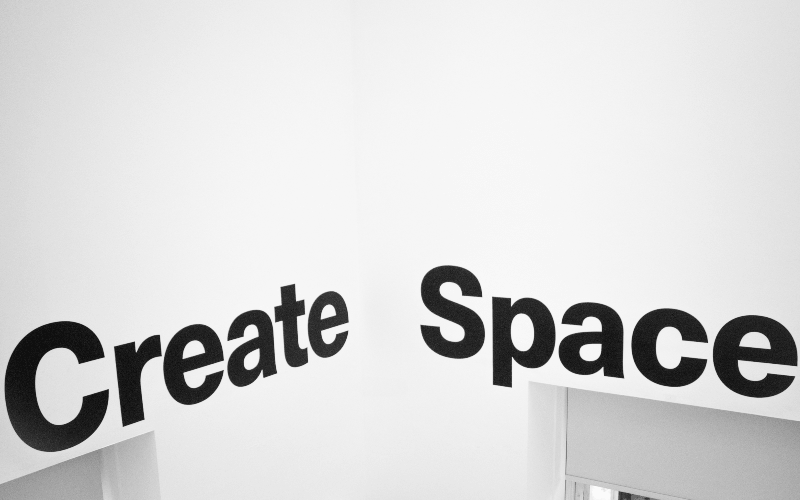
If you are worried that all that negative space (white space) that you have will look boring, then you are wrong. It will concentrate the attention of the reader on particular things which the creator can emphasize. When the website layout is poor, it will be hard for users to navigate and understand the message. By adding white space you can complement and enhance the main subject and make text or image easier to recognise. Another big plus is that it keeps visitors on the page for the longer periods of time. So all things that are considered top priority should be surrounded by negative space.
6. Make it Easy to Use

The average time that person stays on the page is about 10-20 sec. By that time visitors can skim a page and once on your page, visitors should be able to easily find all the information they want. For that purpose add vertical navigation if you want to have a long-scrolling website. By doing so viewers will be able to quickly jump from one part of the site to the other. Work on your footer. It will be the last thing that people will see and you should leave all the important links there, contact information, social media icons and a shortened version of your menu. And don’t forget about your menu. It should be easy to find and well structured.
7. Consistency is the Key
![]()
Users easily get used to the style of the web page and the content they can expect from it. It is important to keep all the elements like pictures, buttons, fonts, link colours the same throughout your site. And don’t forget about your content, if it’s articles they should have constant tone, mood, quality, and quantity. Now, when you are sure that everything matches in style, colours, space, typography, branding, don’t forget to match not only visual elements but also the functional ones. This way things will be predictable for the visitor and improve the usability of your website. Don’t forget to check if everything is working the same way. This way people will get a great experience.
8. Scrolling Over Clicking
It may be a surprise to some people, but actually, it’s better to put everything on one long page. If we look at Instagram, Facebook or other social media they all would have one thing in common: it’s a never-ending scrolling page. By making your page the same way it will help visitors to digest information on their own time, it delivers information quickly because there is no need to wait for the page to load. But the minus is that analytics can track clicks but not scrolls.
9. Icons Instead of Words
![]()
Icons are great since they give you the same information without any words and peoples eye fixes images much faster than text. When used correctly icons can improve usability and the design of the webpages or software. By adding them you can draw attention to a specific part of a page. If you want to structure content you can add icons as bullet points it will make it more eye-catching. As a bonus, they can be personalized, which will bring some style to the site. If you are not sure how to use some of the icons it’s better to stick to universally understood ones.
10. Avoid Carousel and Rotating Sliders

These were popular for a long time. But there is one problem, they are completely useless. The first slide is the one that everyone clicks on and the rest are just getting ignored. The reasons for that is that people are more likely to scan the site and not make a couple of extra clicks. But even more often people don’t have enough time to even read what’s on the first slide since the carousel moves automatically. So there is no point in creating a carousel out of 3 slides if people will only see the first one. Another very important con is that they make site load much longer and this may affect how many visitors your website will have.
11. Carefully Pic Pictures
Maybe not many people think about it but we draw out attention to people’s faces more than to anything else. But don’t just add the pictures. The picture that was chosen and placed right can replace the big block of text giving the same information. Also, a lot of the time people skip articles and focus on content and pictures. If you already added a lot of pictures to get the attention of all those visitors and now want to also create a gallery, then try out our Gallery plugin. It is easy to navigate and can improve the overall page appearance of your WordPress website.

Conclusion
While making your first website look at it from the visitors perspective. Does it look good? Is it comfortable to use? How fast does it load? Those are the questions you need to ask yourself in order to make something that people will want to visit. To understand how all it works try to look at and compare the sites of popular companies. Analyze what they have in common. Make conclusions, and try applying it to your future webpage.