A landing page is a separate web page designed solely for a marketing or advertising campaign in digital marketing. It’s the location where a visitor “lands” after clicking on a link in an email or ads from Google, Facebook, Instagram, Twitter, or other websites.
Unlike web pages, which usually have multiple purposes and promote research, landing pages have a single emphasis or goal, referred to as a call to action.
Landing pages are the ideal tool for raising the conversion rates of your marketing campaigns and minimizing the cost of gaining a lead or sale because of this concentration. And therefore, a must for making business in the Web.
Design Principles
The main purpose of the landing page is to draw the user’s attention to your company’s goods or services. It should be eye-catching, as informational as possible, but laconic at the same time in this regard.
The following tips will assist you in improving a landing page and making its functionalities as swift and successful as feasible in order to increase conversion.
1) Define your target audience.
In any field concerned with generating something that people would use, this is the most important factor. They may benefit greatly from a product or service, but how will they learn about it? Begin by considering who your design is for, how potential buyers would perceive it, and how you may persuade them to purchase your product. Don’t be afraid to visualize yourself in the shoes of the user.
2) It’s the simplicity that draws people’s attention.
In any event, the daily onslaught of information overwhelms anyone. In this regard, most users, on the other hand, seek out online pages that will take them little time to navigate and will not overwhelm them with information.
3) Content
The page’s content is, without a doubt, the most important factor. Because the basic information is given by linguistic means, regardless of how appealing her appearance is. The main rule is to stay away from jargon, difficult phrases, and improper vocabulary.
4) Registration Form
Because most users are concerned about the security of their personal information, they pause before filling out an online form. You, as the creator, must decrease the quantity of data required to the bare minimum and give the user the ability to fill it in fast and effortlessly.
5) Color Design
This is a feature that is frequently missed and is unnecessary. However, if you think about it, you’ll be able to reap a lot of benefits from it. The fact is that the user’s perception of the information on the page is influenced by the color palette. Different hues elicit various emotions. As a result, you can use emotion to affect a potential client’s attitude toward your product or service. Think carefully about it and stick to the general design principles and tactics. Use no more than 3 main colors for your landing page and highlight the most important parts (i.e. “to buy” button) with a contrasting one.
6) Visual content
An appealing landing page is made up of good text, high-quality design, and image support.
You will considerably enhance the conversion rate if the photos make the core idea of the website more understandable. The user’s confidence and desire to participate will be bolstered by videos or photographs of the suggested goods or services. Of course it might be problematic if your service or goods are digitalized, but you can be creative about it a bit, and never skip it.
7) Optimize for Mobile
The majority of your potential clients use smartphones to browse the Internet since it is a convenient and inexpensive way to do so in any free time. The site should be optimized for mobile devices to avoid losing their attention. The more you can affect a web page visitor’s convenience, the more opportunities you’ll have to work with them in the future.
8) Objects on the page and their locations
Keep in mind that the most crucial information should display right in front of the user’s eyes.
The initial few words have the greatest impact. If the client is interested, he will pay attention to the vital details. Remove any unnecessary details. First of all that includes a trash like pop-ups, banners, and links.
Necessary Elements
A good landing page will sell absolutely any product or service. To this end, when creating a landing page, it is important to pay special attention to its structure and content.
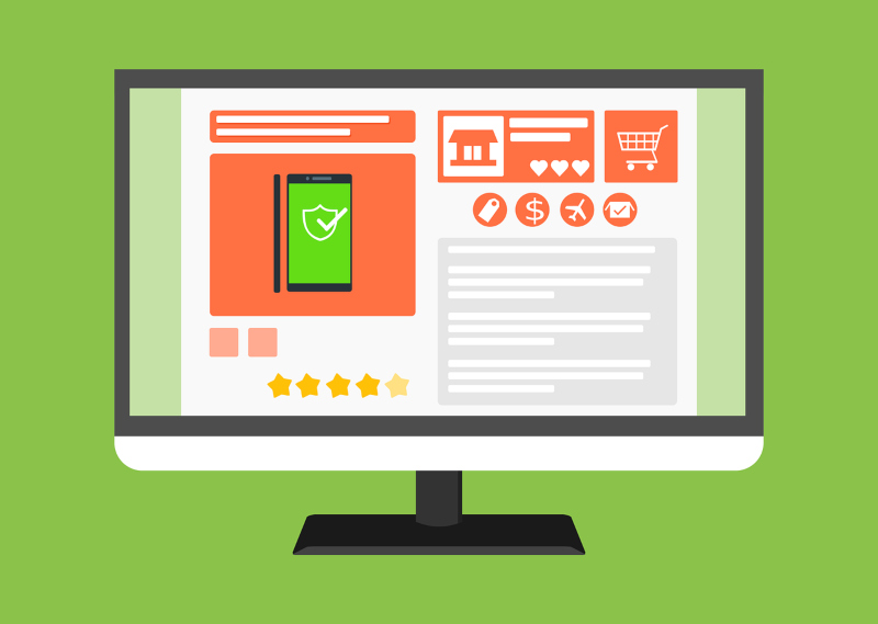
The First Screen
On every landing page, regardless of its length and subject matter, there is a mandatory first screen. This is the most important meaningful block, highlighted graphically. On the first screen is located an offer and a brief description of the client’s problem, which he can solve with the help of your product or service. The text here should be so simple that it can be understood at a glance. Keep in mind: no headline – no sale. You also shouldn’t make an intriguing headline, because by doing so you might scare away some of your visitors. Make the headline as simple and clear as possible, reflecting the essence of the problem of the target audience.
On the first screen also should be placed a few additional elements: the name of the company, lead form and call to action, links to social networks, and other contact information. The name of the organization is a mandatory element. Everything else is up to you.
The above elements are required in order to motivate some users to place an order right away. “Hot” customers won’t study the webpage for a long time. They are more likely to call you when they see the phone number on the first screen, or immediately send a request. Take this into account when designing the structure of a selling landing page.
Logo
Using the logo on the landing page or not is boiling down to how renowned your brand is. The more fame you get the more necessary it becomes, and if you are not known… well. All unnecessary elements should be discarded.
Order form
The more expensive the product, the more time the user needs to think about whether or not to buy it. So, for example, even if a potential client really needs a tractor, he’s unlikely to make a lightning-fast decision about buying it. Consider this, placing an order form on the first screen.
If the product or service is simple enough, the order form is appropriate. If most users definitely need time to think about a purchase, place a small “Contact Us” button on the first screen. On the space saved, you can place a subheading or an illustration.
Product image
Half of the success of the landing page depends on the image of a product you choose. Even if the landing page has the perfect structure and all the marketing requirements are met, conversion rate can be close to zero for the simple reason that the image does not reflect the essence of the product or service, is of poor quality, or is absent altogether. Visual plays a crucial role today, do not forget about it.
Offer
The selling proposition is the main thing on the landing page. It should talk about the benefits of the product and the reasons to buy it. Make your offer simple and understandable so that the client can understand the essence and value of the offer in a couple of seconds.
Usually, companies try to highlight the advantages of the offer they make. The three pillars of it are quality – when your product is far superior to your adversaries`, speed – when you can deliver it faster than anyone, or price – smack a juicy discount on your page, that should convince your potential customers to buy it.
You can use a couple of baits instead of one, but don’t forget, the offer should be brief and easy to grasp.
Conclusion
In conclusion, it should be added that only by the means of split testing you can achieve high conversions. By consistently testing each element, you can determine which combination of headline, subheadline, description, image and elements to pick makes the landing page sell.
Don’t forget to analyze and properly identify your target audience issues. If there is an opportunity to survey users who have left their contact information but have not made a purchase, be sure to take advantage of this opportunity.