Introduction: Why Website Structure Matters
A well-thought-out website structure is a critical foundation for any successful online project. While there is no universal formula for the perfect structure, understanding how to arrange your pages for both user experience and SEO purposes is essential. Search engines have specific requirements that need to be followed, whether you like it or not. Creating an intuitive structure is key to enhancing navigation and ensuring your website is indexed efficiently.
Understanding the Importance of Logical Structure
The logical structure of a website refers to how all pages are organized and linked, creating a clear hierarchy. Pages should be categorized logically, from broad to specific, ensuring users can easily find the information they need.
Definition and Recommendations

The logical structure of the site is a set of all pages on the site, arranged in accordance with the hierarchy. That is the relationship of the pages in which you can trace their belonging to sections, categories, subcategories, and other types of pages (product pages, tags, filters, and so on).
The structure of the site should be constructed in such a way as to facilitate the transition from general topics to specific information, for which they came. It affects the comfort of the user, the time he spent on your site, and the target action, which he will do. Confusing the navigation system and excessive structuring of content will not lead to anything good.
The right structure is important for both the user and the search engines.
The main benefits of a properly organized structure:
- Improved usability. Simple and easy navigation allows the user to find the information they need faster. This will keep him on the site and improve behavioral ranking factors.
- Accelerating the indexing of pages. The logical structure of the site helps search robots understand which pages are important for the webmaster and the end user. Optimizers adhere to the rule of three clicks, where the most important pages should not be located further than 3 clicks from the main page. Otherwise, search engines may not index the page, do it later, or its priority will be very low.
- Reducing the number of technical errors. Proper structure will avoid a large number of duplicate pages, which will save time and money on promotion.
- Distribution of internal reference weight. Link weight is distributed in accordance with the importance of pages. It is necessary that the key pages (such as a cart page for e-commerce websites) are led to by a sufficient number of internal links. The more links lead to priority pages, the more important they are for search engines.
- Coverage of a large number of requests. Creating additional sections, categories and landing pages for narrow groups of queries makes it possible to rank for a large number of keywords. Such pages will be more relevant to a selected narrow group of queries, which will attract more organic traffic.
Benefits of a Properly Organized Website Structure:
- Improved Usability: Users can navigate your website more easily, which increases engagement and decreases bounce rates.
- Better Search Engine Indexing: An organized structure helps search engines understand which pages are most important, speeding up the indexing process.
- Fewer Technical Errors: A well-planned structure reduces issues like duplicate content, saving time and resources.
- Efficient Internal Linking: Internal links should lead to priority pages to maximize SEO value.
- Expanded Keyword Coverage: A clear structure allows you to rank for a broader range of keywords by creating more targeted pages.
Types of Website Structures
Choosing the right structure for your website depends on your goals and the type of website you’re building. Here are the main types of website structures:
1. Linear Structure
This is a basic, chain-like structure where pages are linked in a linear sequence. While it’s easy to navigate, it’s not ideal for SEO because it doesn’t allow for the prioritization of important pages. This structure is typically used for business card sites or presentation websites where pages follow a simple flow.
2. Simple Structure
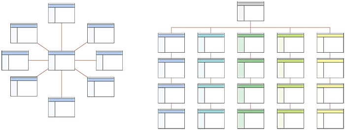
In a simple structure, you have a main page with several subordinate pages. The pages are connected to the home page and organized in a straightforward manner. For example, a photographer’s portfolio website would have a main page with links to galleries and services.
3. Hierarchical Structure
The most popular and SEO-friendly structure, where pages are organized into categories and subcategories. This structure is ideal for e-commerce sites, blogs, and content-rich websites, as it allows you to organize large amounts of information while ensuring important pages are easily accessible.
Visual Examples of Simple and Hierarchical Structures

Common Mistakes to Avoid When Designing Website Structure
Building a site’s structure might seem straightforward, but many developers make common mistakes that can hurt both user experience and SEO. Here are some typical pitfalls:
1. Separate Page for the Catalog
It’s unnecessary and inefficient to create a separate page for your product catalog. This increases URL length and adds unnecessary steps to the user journey. Always include the catalog on the homepage or directly link it to the relevant section.
2. Duplicate Titles or Content
Duplicate content confuses search engines and can harm your SEO rankings. For instance, if the same product appears in multiple categories with identical titles, this can lead to a decrease in overall site performance.
3. Products in Both Categories and Subcategories
Avoid placing products in both categories and subcategories, as this creates unnecessary duplication. Search engines treat these as redundant content, negatively affecting your SEO.
4. Empty or Nearly Empty Categories
Categories with minimal content can create a poor user experience. A sparse selection of products or articles makes it harder for users to find what they’re looking for and may cause them to leave your site. If a category doesn’t have enough content, consider removing it temporarily.
5. Filters Before Category Selection
Ensure that filters are applied after users select a category. It can be confusing if a user clicks “Smartphones” only to be greeted with filter options first, rather than seeing the products categorized under “Smartphones.”
6. Limited Filters and Parameters
Large e-commerce sites or content-heavy portals require multiple filtering options to help users find what they need more efficiently. A flexible filter system is essential for websites with many products or articles.
7. Categories Named After Brands
While using brand names as categories can work for very popular brands, it’s generally more effective to use product categories. Classic categories, like “Smartphones” or “Laptops,” are better for most e-commerce sites.
Conclusion: Building a Website Structure for Success
The logical structure of your website significantly impacts its usability, SEO, and user engagement. An organized structure ensures your content is easy to find, improves your site’s search engine ranking, and reduces the risk of technical errors. While the design and structure of a website can differ greatly depending on the project’s needs, a hierarchical structure is often the best choice for most sites.
As for the WordPress users, BestWebSoft can gladly help you with structuring. The Sitemap plugin can make short work of helping search engines like Google to index your website. Be it a blog, an e-commerce site, an aggregator, or any other kind of website.


